Art Experience, Art Review
Red Bathroom Blues at SFMOMA
Two Lobbies
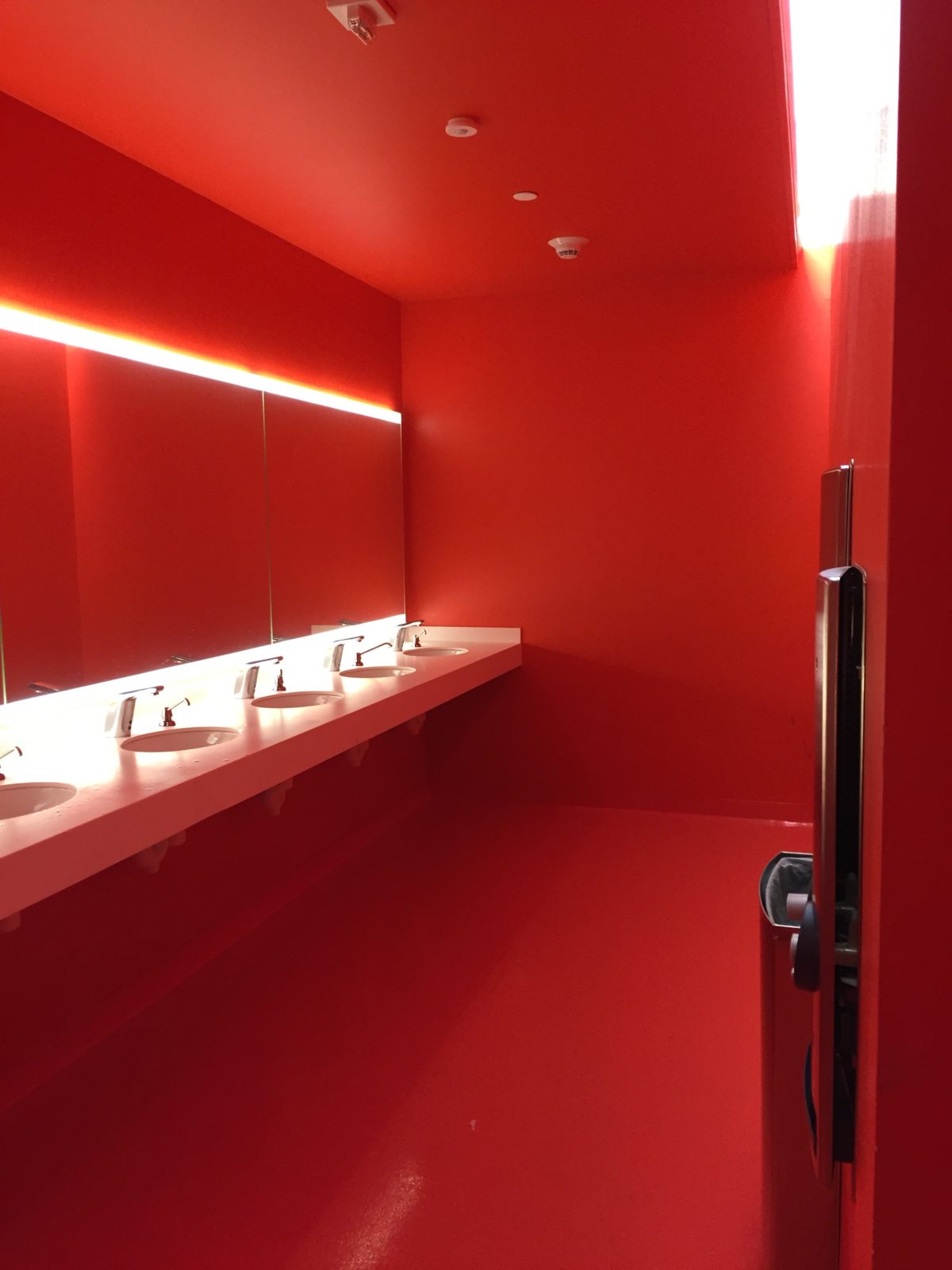
The red bathroom is what made the strongest impression on me last week when I finally had time to visit the newly reopened San Francisco Museum of Modern Art. The expansive new building was designed by the acclaimed firm Snøhetta. The new building joins to the old familiar Mario Botta-designed building which faces Third Street and the Yerba Buena Center. There are now two lobbies. The first is the original Third Street atrium through which you can climb the stairs to the second floor.
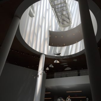
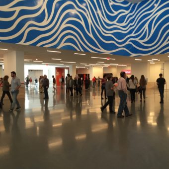
This bring you to the vast new main lobby which has also an entrance on Howard Street near the W Hotel. This new lobby stretches the whole length of the new building and feels designed to accommodate huge crowds.
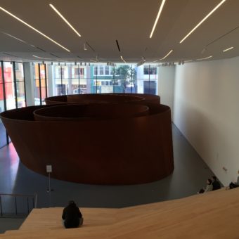
The lobby is anchored at one end by a cascade of wooden bleachers overlooking an installation of Richard Serra’s sculpture Sequence. The sculpture is a curling spiral wall of rusty steel, best appreciated from above from the convenient bleachers. If you venture to walk through the sculpture (no touching, please) you might feel like a rat in a maze where the walls are tilting in on you. This experience could potentially be a claustrophobic nightmare.
Red Bathroom
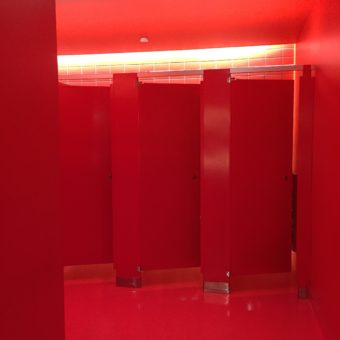
At the other end of the lobby, SFMOMA continues the nightmare theme with a ladies’ room out of a horror film. Red walls, red stalls, red floors, and red ceiling are all the same bright shade of fresh blood. In Stanley Kubrick’s film, The Shining, the red bathroom signifies danger and sets a really creepy tone. The creep factor is magnified at SFMOMA because there is no contrast in the room. Everything is the same color and shade of red. When I exited to the lobby, my color vision was completely distorted by the ‘opposite color’ effect. This created an illusion where everything I saw appeared to be tinted green. I’m not sure what artistic statement the architects were making but I’m not likely to forget the experience. If you want a peek at the purple urinals in the men’s room and see another view of the red bathroom, check out this article from Curbed San Francisco.
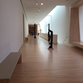
Lobbies and bathrooms aside, did I like the new museum? I’m still on the fence about that. The scale is so much larger than the old one. There are high ceilings, roomy galleries, and acres of blond hardwood floors. The blond wood stairs are so light in fact that it is hard to see your way from step to step when going downstairs. The sensation was more like a blond wood waterfall than stairs.
New Galleries
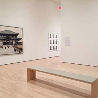
The galleries displaying works of Anselm Kiefer and other art from the Fisher Collection are magnificent. The huge paintings look great in the big, light spaces. There is even a freight elevator to move art throughout the museum’s seven floors with doors that occupy the entire side of one room. That elevator must be sixteen feet wide!
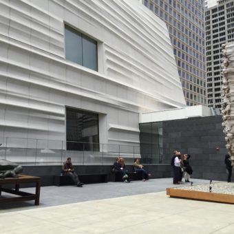
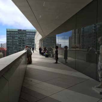
The redone museum doesn’t feel at all like the old familiar SFMOMA. Although, you can step back in time and visit familiar art in a familiar setting. The Matisse and Klee collections, etc. are displayed in the same way they used to be hung in the original Botta building. The rest of the Snøhetta-designed space feels vast, impersonal and a bit overwhelming at first. I felt that I could be in a museum in any major city on the globe. The museum didn’t feel specific to San Francisco until I stepped out onto one of the many sculpture terraces to enjoy the view.
Outdoor Spaces
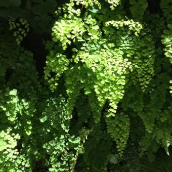
My favorite outdoor space was definitely the living wall of green ferns and other plantings adjacent to the Alexander Calder galleries. That terrace also seemed much more San Francisco specific because this green wall could probably only flourish in the Bay Area climate. It also made me think of the remarkable living roof at the California Academy of Sciences in Golden Gate Park.
The new SFMOMA is definitely too big to take in properly in one visit. In that respect it has more in common with New York’s Metropolitan Museum of Art than the old SFMOMA. I love that there is so much more display space, but I’m afraid that something got lost in translation. But then, I’ve always been slow to accept change. Perhaps I’ll come to love the new SFMOMA as much as the old one. After all, San Francisco has changed so much in the last 20 plus years that I’ve lived here. Mission Street below Third Street has morphed from a scrappy collection of small buildings into a vast corridor of glass high-rise towers. True, it is very imposing, but I’m glad that I saw it before the transformation. I’m also glad that I enjoyed the comfortable intimacy of visiting the old SFMOMA for so many years before the redesign and expansion.

